Onboarding for Trell
Trell is a lifestyle social commerce platform which offers meaningful & one of it’s kind shoppable content.
Trell aims to facilitate content-inspired commerce experiences for India's digital native youth that add value to their lives and bring positive change across individuals and communities.
Project duration:
August 2021 to January 2022


Project overview

The Problem:
-
Complex onboarding process with lots of steps to land on the main page.
-
App asking for too many permissions during the onboarding process, leading to user discomfort and drop-offs.
-
Users have different expectations from the app, which do not match the actual user flow.
-
A high drop-off rate of 40% during the onboarding flows, indicating user discomfort and dissatisfaction.
-
Only 15% of users are able to find the shoppable products, indicating a lack of proper navigation and product placement.

My Role:
Lead UX Designer.

The Goal:
-
Simplify the onboarding process to reduce drop-offs and increase user satisfaction.
-
Optimize app permission requests to improve user trust and reduce drop-off rate.
-
Align user expectations with the app's messaging, user flow, and value proposition to increase user engagement and retention.
-
Improve landing pages to align with user interests, improve satisfaction, engagement, and retention.
-
Align advertising with actual user flow to improve retention rates and satisfaction.
-
Improve navigation and product placement to increase user engagement, satisfaction, and conversions.

My Responsibilities:
I was responsible for:
-
Conducting user research to understand user needs and behaviours
-
Creating personas, user flows, and wireframes to design intuitive and user-friendly interfaces
-
Collaborating with cross-functional teams, such as product managers, marketing team and developers, to ensure design solutions align with business goals and technical constraints
-
Conducting usability testing to validate design decisions and iterate on designs
-
Creating high-fidelity prototypes and design specifications for development teams

Understanding the user
Target Audience:
We are looking at an audience that comprises Gen Z (18-27) that overlaps with Millenials (28-35), from Tier 1 & 2 cities who are looking for unique and personalised digital experiences around the clock that add value to their lifestyle.
Some Key Points About Them:
-
Digital natives (Average 8 hours online/ 55% say their lives run on technology)
-
Looking for new and relevant experiences online (66% say tech helps them gain new experience)
-
Phygital Shoppers (79% shop both online + offline)
-
Eager for personalized products/content and also willing to pay a premium for products that highlight their individuality
User Research Summary:
The research aims to gain insights into user behavior, preferences, and pain points related to the app's user experience through qualitative and quantitative methods like surveys, interviews, and usability testing. The goal is to optimize the product to increase user engagement, retention, and conversions.
Pain Points:

Pain Points
The onboarding process for Trell's app too complicated, with too many steps to land on the main page, leading to drop-offs and low retention rates.
Pain Points
Users may find it challenging to find the shopable products they are looking for on the app, resulting in frustration and low conversion rates.
Pain Points
Users landing on the content page instead of the commerce page, leading to a mismatch between user expectations and what they see. This could result in low engagement and user churn.
Pain Points
The app may have too many permission requests, causing a poor user experience and leading to low engagement and retention rates.
User Persona
User Journey


Awareness
Here are Few Acquisition Channels We Covered:
-
By browsing app stores recommended (App Store Optimization (ASO)
-
Saw an ad on TV/YouTube (Digital Video)
-
Organic Mobile User Acquistioin
-
Saw an ad while using another app/browsing the web (Paid Advertising)
-
I see them shared on social networks (Influencer Marketing)
-
My friends/family are using them. (Word of mouth promotion – Referral Marketing)
-
I read about them online (PR & Press)
-
Email Marketing

Starting the design
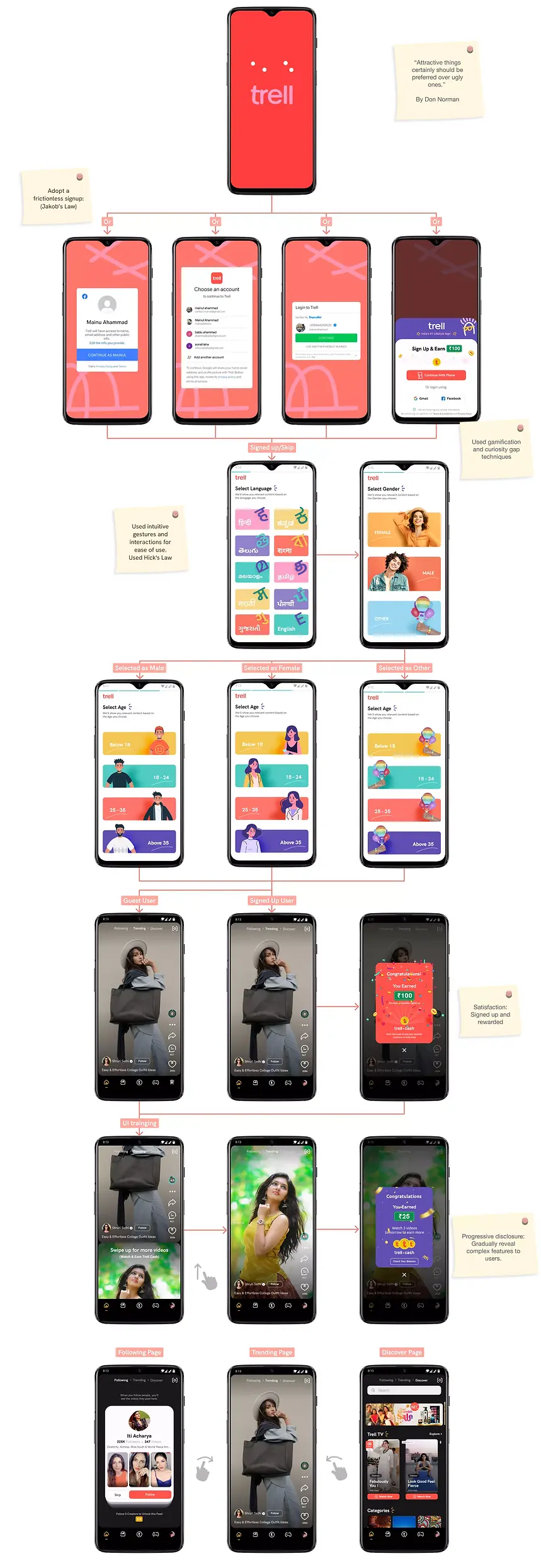
Onboarding flow for first time user:
-
Simplify the app onboarding process and remove unnecessary steps and permissions to decrease dropoff rates.
-
Focus on essential features and communicate them clearly to improve user success and engagement.
-
Use gamification and curiosity gap techniques to make the app more engaging and increase user retention.
-
Ensure easy navigation and product discoverability to help users find what they are looking for.

Wireframes: (Onboarding)

Wireframes: (Commerce product discovery)

Usability study: findings
We focused on these below points to evaluate user interaction with a product and identify areas for improvement.
-
Learnability
-
Efficiency
-
Memorability
-
Errors
-
Satisfaction
We followed few types of usability studies:
-
A/B testing of different versions of our product to determine which design or feature set is more effective or preferred by users.
-
Cognitive walkthroughs to identify potential issues with the mental workload required to use our product.
-
Card sorting exercises to understand how users group and categorise information on our app.
-
Surveys/interviews to understand user needs and preferences.
Findings:
We understand asking permission(Contact access/Notification permission) in the onboarding flow is just not right.
So we follow few laws and tricks:
Progressive disclosure is a useful design principle to gradually reveal complex features to users.
If we want to ask for information or permissions, make sure we have given value before.
Respect > Data:
-
We wouldn't greet a stranger on the street and ask for the keys to their house.
-
This prompt is the digital equivalent.
-
Build trust before we ask for data.
-
And explain clearly why we need it
Adopt a frictionless signup: (Jakob’s Law)
Most businesses will benefit from keeping their signup process as quick and easy as possible as part of their onboarding experience.
The point here is to reduce Time to Value and get our customer using our product as efficiently as possible.
Classic ways of reducing signup friction include:
Allowing customers to sign up via a third party, such as Gmail/Facebook/Truecaller etc
Enabling autocomplete to save customers from typing
Adopting a minimalistic UI with as few elements as possible besides the sign-up CTA
Asking your customers as few questions as possible during the signup phase
Existing Solution

Findings:

Refining the design
Design Objective:
-
Create visually appealing and user-friendly interface
-
Focus on simplicity and clarity
-
Use clean and consistent layout for easy navigation
-
Incorporate cohesive and engaging visual style
-
Use primary color with few accent colors for UI elements
-
Use easy-to-read typography with clear language
-
Include subtle animations for visual feedback and interactivity
-
Use intuitive gestures and interactions for ease of use
-
Deliver user-friendly and aesthetically pleasing experience in line with brand vision and values
Interactive Prototype


Wireframes: (Commerce product discovery)
Existing Design:

Final Solution:

Going forward

Impact:
We achieved a successful onboarding rate from 60% to 95% for the first-time (Day 0) user.

What I learned:
Here are few things I have learned from this case study whiling I was working on this project:
-
The importance of user research: User research is a critical part of the UX design process.
-
The value of prototyping: Prototyping is a way to test out design ideas and get feedback from users early in the design process.
-
The role of collaboration: I worked with developers, stakeholders, or other team members to achieve the final product.
-
The importance of empathy: Good UX design requires empathy for the user. I put myself in the user's shoes to create our product that meets their needs and solves their pain points.

Next steps:
We have achieved such a significant increase in our onboarding rate! 60% to 95%. It is a remarkable achievement. By increasing the onboarding rate, we can now ensure that more users have a successful experience with our product from the very beginning.
It's essential to keep track of the onboarding rate and monitor it regularly to ensure that it remains high. If we notice any drop in the rate, it may be necessary to identify the cause and take steps to address it promptly. Additionally, we may want to consider conducting user surveys or gathering feedback from our team to gain insights into the user experience and identify areas for improvement.
Overall, it's clear that we have put in a lot of effort to improve the onboarding process and create a positive user experience. and continue to focus on delivering a top-notch product that meets the needs of our users!